玩转Qml(6)-进度条定制
本文于
1053
天之前发表,文中内容可能已经过时。
简介
本文是《玩转Qml》系列文章的第六篇,涛哥将教大家,进度条组件的定制。
源码
《玩转Qml》系列文章,配套了一个优秀的开源项目:TaoQuick
github https://github.com/jaredtao/TaoQuick
访问不了或者速度太慢,可以用国内的镜像网站gitee
https://gitee.com/jaredtao/TaoQuick
先看预览图

新的渐变效果
Qt 5.12 加入了新的渐变效果,一共180种,效果来自这个网站https://webgradients.com
按照帮助文档的介绍,可以通过下面这两种方式使用
1
2
3
4
5
6
7
8
9
| Rectangle {
y: 0; width: 80; height: 80
gradient: Gradient.NightFade
}
Rectangle {
y: 0; width: 80; height: 80
gradient: "NightFade"
}
|
涛哥立即想到了,枚举不就是数字嘛
1
2
3
4
5
6
7
8
9
10
11
12
| Rectangle {
y: 0; width: 80; height: 80
gradient: 1
}
Rectangle {
y: 0; width: 80; height: 80
gradient: 2
}
Rectangle {
y: 0; width: 80; height: 80
gradient: 3
}
|
试了一下,这样也是可以啊,哈哈。
于是涛哥就把180种渐变效果都拉出来看看。
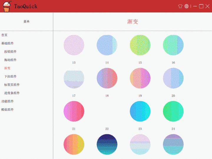
Qt只支持水平和垂直的渐变,其中有小部分是不能用的,所以只有165个能用。
看一下展示全部渐变的Qml代码:
1
2
3
4
5
6
7
8
9
10
11
12
13
14
15
16
17
18
19
20
21
22
23
24
25
26
27
28
29
30
31
32
33
34
35
36
37
38
39
40
41
42
43
| import QtQuick 2.9
import QtQuick.Controls 2.5
Item {
anchors.fill: parent
GridView {
id: g
anchors.fill: parent
anchors.margins: 20
cellWidth: 160
cellHeight: 160
model: 180
clip: true
property var invalidList: [27, 39, 40, 45, 71, 74, 105, 111, 119, 130, 135, 141]
delegate: Item{
width: 160
height: 160
Rectangle{
width: 150
height: 150
anchors.centerIn: parent
color: "white"
radius: 10
Text {
anchors.horizontalCenter: parent.horizontalCenter
anchors.top: parent.top
anchors.topMargin: 2
text: index + 1
}
Rectangle {
width: 100
height: width
radius: width / 2
gradient: g.invalidList.indexOf(modelData + 1) < 0 ? modelData + 1 : null
anchors.centerIn: parent
anchors.verticalCenterOffset: 10
}
}
}
}
}
|
条形进度条
普通进度条的原理,就是有一个比较长的矩形做背景,在上面放一个颜色不同的矩形,其宽度跟着百分比变化,
100%时宽度与背景一致。
可以写一个很简要的进度条。
1
2
3
4
5
6
7
8
9
10
11
12
13
14
15
16
| Rectangle {
id: back
width: 300
height: 50
radius: height / 2
color: "white"
property int percent: 0
Rectangle {
id: front
width: percent / 100 * parent.width
height: parent.height
radius: parent.radius
color: "red"
}
}
|
再添加一点元素,在右侧放一个文本,表示百分比,或者放图片。甚至给进度条加个闪光特效。
经过一系列的加工,封装成一个综合的组件,最终结果如下:
1
2
3
4
5
6
7
8
9
10
11
12
13
14
15
16
17
18
19
20
21
22
23
24
25
26
27
28
29
30
31
32
33
34
35
36
37
38
39
40
41
42
43
44
45
46
47
48
49
50
51
52
53
54
55
56
57
58
59
60
61
62
63
64
65
66
67
68
69
70
71
72
73
74
75
76
77
78
79
80
81
82
83
84
85
86
87
88
89
90
91
92
93
94
95
96
97
98
99
100
101
102
|
import QtQuick 2.12
import QtQuick.Controls 2.12
Item {
id: r
property int percent: 0
implicitWidth: 200
implicitHeight: 16
enum BarType {
Text,
SucceedOrFailed,
NoBar
}
readonly property color __backColor: "#f5f5f5"
readonly property color __blueColor: "#1890ff"
readonly property color __succeedColor: "#52c41a"
readonly property color __failedColor: "#f5222d"
property color backgroundColor: __backColor
property color frontColor: {
switch (barType) {
case TNormalProgress.BarType.SucceedOrFailed:
return percent === 100 ? __succeedColor : __failedColor
default:
return __blueColor
}
}
property string text: String("%1%").arg(percent)
property int gradientIndex: -1
property bool flicker: false
property var barType: TNormalProgress.BarType.Text
Text {
id: t
enabled: barType === TNormalProgress.BarType.Text
visible: enabled
text: r.text
anchors.verticalCenter: parent.verticalCenter
anchors.right: parent.right
}
Image {
id: image
source: percent === 100 ? "qrc:/Core/Image/ProgressBar/ok_circle.png" : "qrc:/Core/Image/ProgressBar/fail_circle.png"
height: parent.height
width: height
enabled: barType === TNormalProgress.BarType.SucceedOrFailed
visible: enabled
anchors.right: parent.right
}
property var __right: {
switch (barType) {
case TNormalProgress.BarType.Text:
return t.left
case TNormalProgress.BarType.SucceedOrFailed:
return image.left
default:
return r.right
}
}
Rectangle {
id: back
anchors.left: parent.left
anchors.right: __right
anchors.rightMargin: 4
height: parent.height
radius: height / 2
color: backgroundColor
Rectangle {
id: front
width: percent / 100 * parent.width
height: parent.height
radius: parent.radius
color: frontColor
gradient: gradientIndex === -1 ? null : gradientIndex
Rectangle {
id: flick
height: parent.height
width: 0
radius: parent.radius
color: Qt.lighter(parent.color, 1.2)
enabled: flicker
visible: enabled
NumberAnimation on width {
running: visible
from: 0
to: front.width
duration: 1000
loops: Animation.Infinite;
}
}
}
}
}
|
圆形进度条
将一个Rectangle做成圆形: 宽高相等,半径为宽度一半。
再把 颜色设置为透明,边框不透明,边框加粗一点,就是一个圆环了。
1
2
3
4
5
6
7
8
9
| Rectangle {
id: back
width: 120
height: width
radius: width / 2
color: "transparent"
border.width: 10
border.color: "white"
}
|
接下来给圆环贴上一个圆形渐变色,渐变按照百分比来做。
1
2
3
4
5
6
7
8
9
10
11
12
13
14
15
16
17
18
19
20
21
| import QtGraphicalEffects 1.12
Rectangle {
id: back
width: 120
height: width
radius: width / 2
color: "transparent"
border.width: 10
border.color: "white"
property int percent: 0
ConicalGradient {
anchors.fill: back
source: back
gradient: Gradient {
GradientStop { position: 0.0; color: "white" }
GradientStop { position: percent / 100 ; color: "red" }
GradientStop { position: percent / 100 + 0.001; color: "white" }
GradientStop { position: 1.0; color: "white" }
}
}
}
|
渐变从0 到 percent处都是有渐变颜色的, 再从percent + 0.001 到1.0处,都是背景色,这样就是一个简易的圆形进度条了。
不过这里percent为100的情况,圆形渐变处理不了,我们可以特殊处理,直接让背景圆环变成前景色就行了。(既然都100%了,背景肯定是全部被遮住了,那就让背景做前景,藏掉真正的前景)
1
2
3
4
5
6
7
8
9
10
11
12
13
14
15
16
17
18
19
20
21
22
23
24
| ```qml
import QtGraphicalEffects 1.12
Rectangle {
id: back
width: 120
height: width
radius: width / 2
color: "transparent"
border.width: 10
border.color: percent === 100 ? "red" : "white" //百分比为100时显示为前景,否则显示为背景
property int percent: 0
ConicalGradient {
anchors.fill: back
source: back
enabled: percent != 100 //百分比不为100时有效
visible: enabled //百分比不为100时有效
gradient: Gradient {
GradientStop { position: 0.0; color: "white" }
GradientStop { position: percent / 100 ; color: "red" }
GradientStop { position: percent / 100 + 0.001; color: "white" }
GradientStop { position: 1.0; color: "white" }
}
}
}
|
再加点料,封装成组件
1
2
3
4
5
6
7
8
9
10
11
12
13
14
15
16
17
18
19
20
21
22
23
24
25
26
27
28
29
30
31
32
33
34
35
36
37
38
39
40
41
42
43
44
45
46
47
48
49
50
51
52
53
54
55
56
57
58
59
60
61
62
63
64
65
66
67
68
|
import QtQuick 2.12
import QtQuick.Controls 2.12
import QtGraphicalEffects 1.12
Item {
id: r
property int percent: 0
enum BarType {
Text,
SucceedOrFailed,
NoBar
}
readonly property color __backColor: "#f5f5f5"
readonly property color __blueColor: "#1890ff"
readonly property color __succeedColor: "#52c41a"
readonly property color __failedColor: "#f5222d"
property color backgroundColor: __backColor
property color frontColor: {
switch (barType) {
case TNormalProgress.BarType.SucceedOrFailed:
return percent === 100 ? __succeedColor : __failedColor
default:
return __blueColor
}
}
property string text: String("%1%").arg(percent)
property var barType: TNormalProgress.BarType.Text
Rectangle {
id: back
color: "transparent"
anchors.fill: parent
border.color: percent === 100 ? frontColor : backgroundColor
border.width: 10
radius: width / 2
}
Text {
id: t
enabled: barType === TNormalProgress.BarType.Text
visible: enabled
text: r.text
anchors.centerIn: parent
verticalAlignment: Text.AlignVCenter
horizontalAlignment: Text.AlignHCenter
}
Image {
id: image
source: percent === 100 ? "qrc:/Core/Image/ProgressBar/ok.png" : "qrc:/Core/Image/ProgressBar/fail.png"
enabled: barType === TNormalProgress.BarType.SucceedOrFailed
visible: enabled
scale: 2
anchors.centerIn: parent
}
ConicalGradient {
anchors.fill: back
source: back
enabled: percent != 100
visible: enabled
smooth: true
antialiasing: true
gradient: Gradient {
GradientStop { position: 0.0; color: frontColor }
GradientStop { position: percent / 100 ; color: frontColor }
GradientStop { position: percent / 100 + 0.001; color: backgroundColor }
GradientStop { position: 1.0; color: backgroundColor }
}
}
}
|
最后,来个合影
1
2
3
4
5
6
7
8
9
10
11
12
13
14
15
16
17
18
19
20
21
22
23
24
25
26
27
28
29
30
31
32
33
34
35
36
37
38
39
40
41
42
43
44
45
46
47
48
49
50
51
52
53
54
55
56
57
58
59
60
61
62
63
64
65
66
67
68
69
70
71
72
73
74
75
76
77
78
79
80
81
82
83
84
85
86
87
88
89
90
91
92
93
94
95
96
97
98
99
100
101
102
103
104
105
106
107
108
109
110
111
112
| Item {
id: r
anchors.fill: parent
Grid {
id: g
anchors.fill: parent
anchors.margins: 10
columns: 2
spacing: 10
Column {
width: g.width / 2 - 10
height: g.height /2 - 10
spacing: 10
TNormalProgress {
width: parent.width
backgroundColor: gConfig.reserverColor
NumberAnimation on percent { from: 0; to: 100; duration: 5000; running: true; loops: Animation.Infinite}
}
TNormalProgress {
width: parent.width
backgroundColor: gConfig.reserverColor
flicker: true
percent: 50
}
TNormalProgress {
width: parent.width
backgroundColor: gConfig.reserverColor
barType: TNormalProgress.BarType.SucceedOrFailed
percent: 70
}
TNormalProgress {
width: parent.width
backgroundColor: gConfig.reserverColor
barType: TNormalProgress.BarType.SucceedOrFailed
percent: 100
}
TNormalProgress {
width: parent.width
backgroundColor: gConfig.reserverColor
barType: TNormalProgress.BarType.NoBar
percent: 50
gradientIndex: 12
}
}
Row {
width: g.width / 2 - 10
height: g.height /2 - 10
spacing: 10
TCircleProgress {
width: 120
height: 120
backgroundColor: gConfig.reserverColor
NumberAnimation on percent { from: 0; to: 100; duration: 5000; running: true; loops: Animation.Infinite}
}
TCircleProgress {
width: 120
height: 120
backgroundColor: gConfig.reserverColor
barType: TNormalProgress.BarType.SucceedOrFailed
percent: 75
}
TCircleProgress {
width: 120
height: 120
backgroundColor: gConfig.reserverColor
barType: TNormalProgress.BarType.SucceedOrFailed
percent: 100
}
}
Row {
width: g.width / 2 - 10
height: g.height /2 - 10
spacing: 10
TCircleProgress {
width: 120
height: 120
backgroundColor: gConfig.reserverColor
text: String("%1天").arg(percent)
NumberAnimation on percent { from: 0; to: 100; duration: 5000; running: true; loops: Animation.Infinite}
}
TCircleProgress {
id: ppppp
width: 120
height: 120
backgroundColor: gConfig.reserverColor
barType: TNormalProgress.BarType.SucceedOrFailed
SequentialAnimation {
running: true
loops: Animation.Infinite
NumberAnimation {
target: ppppp
property: "percent"
from: 0
to: 100
duration: 3000
}
PauseAnimation {
duration: 500
}
}
}
TCircleProgress {
width: 120
height: 120
backgroundColor: gConfig.reserverColor
percent: 100
}
}
}
}
|
效果如下:
 支付宝打赏
支付宝打赏
 微信打赏
微信打赏