玩转Qml(2)-可以拖动的组件
本文于
1060
天之前发表,文中内容可能已经过时。
简介
本文是《玩转Qml》系列文章的第二篇,涛哥将教大家,如何在Qml中实现可拖动组件,通过拖动
改变组件的大小和位置;以及实现定制窗体(无边框和标题栏), 并把拖动组件应用在顶层窗体。
源码
《玩转Qml》系列文章,配套了一个优秀的开源项目:TaoQuick
github https://github.com/jaredtao/TaoQuick
访问不了或者速度太慢,可以用国内的镜像网站gitee
https://gitee.com/jaredtao/TaoQuick
拖动组件
拖动改变坐标
拖动改变坐标的原理很简单,鼠标移动的时候改变目标Item的坐标即可。
说话的功夫,涛哥就造了个轮子出来
(其实是太常用了,涛哥已经写了很多遍)
1
2
3
4
5
6
7
8
9
10
11
12
13
14
15
16
17
18
19
20
21
22
23
24
25
26
27
28
29
30
31
32
33
34
35
| import QtQuick 2.9
import QtQuick.Controls 2.5
Item {
width: 800
height: 600
Rectangle {
id: moveItem
x: 100
y: 100
width: 300
height: 200
color: "lightblue"
MouseArea {
anchors.fill: parent
property real lastX: 0
property real lastY: 0
onPressed: {
lastX = mouseX
lastY = mouseY
}
onPositionChanged: {
if (pressed) {
moveItem.x += mouseX - lastX
moveItem.y += mouseY - lastY
}
}
}
}
}
|
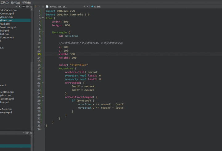
上面例子中的MouseArea是拖动区域,Rectangle是要拖动的目标Item。
为了实现高度的可复用性,涛哥将MouseArea独立封装成一个组件,并提供一个control属性,
让外部使用组件实例的时候指定要拖动的目标。
1
2
3
4
5
6
7
8
9
10
11
12
13
14
15
16
17
18
19
20
21
22
23
24
25
26
27
28
29
30
31
|
import QtQuick 2.9
MouseArea {
id: root
property real lastX: 0
property real lastY: 0
property bool mask: false
property var control: parent
onPressed: {
lastX = mouseX;
lastY = mouseY;
}
onContainsMouseChanged: {
if (containsMouse) {
cursorShape = Qt.SizeAllCursor;
} else {
cursorShape = Qt.ArrowCursor;
}
}
onPositionChanged: {
if (!mask && pressed && control)
{
control.x +=mouseX - lastX
control.y +=mouseY - lastY
}
}
}
|
TMoveArea组件的用法
1
2
3
4
5
6
7
8
9
10
11
12
13
14
15
16
17
| Item {
anchors.fill: parent
Rectangle {
x: 100
y: 200
width: 400
height: 300
color: "darkred"
TMoveArea {
control: parent
anchors.fill: parent
}
}
}
|
一般来说,将
1
| property var control: parent
|
中的var换成确切的类型比如Item会更好一些,Qml底层引擎处理var会慢一些,但是这样就限制了
目标必须是Item或者其子类。var是把双刃剑,有利有弊。涛哥后面要拖动的目标还包括QQuickView
这种类型,所以这里用var就好了。
拖动改变大小
拖动改变大小,原理参考下面这张示意图:
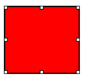
就是在要拖动的目标Item的8个位置分别放一个拖动组件,并在拖动时计算相应的坐标和大小变化即可。
涛哥先是把TMoveArea改造成了TDragRect
1
2
3
4
5
6
7
8
9
10
11
12
13
14
15
16
17
18
19
20
21
22
23
24
25
26
27
28
29
30
31
32
33
34
35
36
37
38
39
40
41
42
43
44
45
46
|
import QtQuick 2.9
import QtQuick.Controls 2.0
Item {
id: root
property alias containsMouse: mouseArea.containsMouse
signal posChange(int xOffset, int yOffset)
implicitWidth: 12
implicitHeight: 12
property int posType: Qt.ArrowCursor
readonly property int posLeftTop: Qt.SizeFDiagCursor
readonly property int posLeft: Qt.SizeHorCursor
readonly property int posLeftBottom: Qt.SizeBDiagCursor
readonly property int posTop: Qt.SizeVerCursor
readonly property int posBottom: Qt.SizeVerCursor
readonly property int posRightTop: Qt.SizeBDiagCursor
readonly property int posRight: Qt.SizeHorCursor
readonly property int posRightBottom: Qt.SizeFDiagCursor
MouseArea {
id: mouseArea
anchors.fill: parent
hoverEnabled: true
property int lastX: 0
property int lastY: 0
onContainsMouseChanged: {
if (containsMouse) {
cursorShape = posType;
} else {
cursorShape = Qt.ArrowCursor;
}
}
onPressedChanged: {
if (containsPress) {
lastX = mouseX;
lastY = mouseY;
}
}
onPositionChanged: {
if (pressed) {
posChange(mouseX - lastX, mouseY - lastY)
}
}
}
}
|
就是把前面的鼠标拖动时的处理逻辑,换成了带参数的信号发送出去,由外面决定怎么用这两个坐标
同时也定义了一组枚举,用来表示拖动区域的位置。位置不同,则鼠标样式不同。
之后涛哥写了一个叫TResizeBorder的组件,里面实例化了8个TDragRect组件,分别放在前面示意图
所示的位置,并实现了不同的处理逻辑。
(后来涛哥把上下左右四个中心点换成了四个边)
1
2
3
4
5
6
7
8
9
10
11
12
13
14
15
16
17
18
19
20
21
22
23
24
25
26
27
28
29
30
31
32
33
34
35
36
37
38
39
40
41
42
43
44
45
46
47
48
49
50
51
52
53
54
55
56
57
58
59
60
61
62
63
64
65
66
67
68
69
70
71
72
73
74
75
76
77
78
79
80
81
82
83
84
85
86
87
88
89
90
91
92
93
94
95
96
97
98
99
100
|
import QtQuick 2.7
Rectangle {
id: root
color: "transparent"
border.width: 4
border.color: "black"
width: parent.width
height: parent.height
property var control: parent
TDragRect {
posType: posLeftTop
onPosChange: {
if (control.x + xOffset < control.x + control.width)
control.x += xOffset;
if (control.y + yOffset < control.y + control.height)
control.y += yOffset;
if (control.width - xOffset > 0)
control.width-= xOffset;
if (control.height -yOffset > 0)
control.height -= yOffset;
}
}
TDragRect {
posType: posMidTop
x: (parent.width - width) / 2
onPosChange: {
if (control.y + yOffset < control.y + control.height)
control.y += yOffset;
if (control.height - yOffset > 0)
control.height -= yOffset;
}
}
TDragRect {
posType: posRightTop
x: parent.width - width
onPosChange: {
if (control.width + xOffset > 0)
control.width += xOffset;
if (control.height - yOffset > 0)
control.height -= yOffset;
if (control.y + yOffset < control.y + control.height)
control.y += yOffset;
}
}
TDragRect {
posType: posLeftMid
y: (parent.height - height) / 2
onPosChange: {
if (control.x + xOffset < control.x + control.width)
control.x += xOffset;
if (control.width - xOffset > 0)
control.width-= xOffset;
}
}
TDragRect {
posType: posRightMid
x: parent.width - width
y: (parent.height - height) / 2
onPosChange: {
if (control.width + xOffset > 0)
control.width += xOffset;
}
}
TDragRect {
posType: posLeftBottom
y: parent.height - height
onPosChange: {
if (control.x + xOffset < control.x + control.width)
control.x += xOffset;
if (control.width - xOffset > 0)
control.width-= xOffset;
if (control.height + yOffset > 0)
control.height += yOffset;
}
}
TDragRect {
posType: posMidBottom
x: (parent.width - width) / 2
y: parent.height - height
onPosChange: {
if (control.height + yOffset > 0)
control.height += yOffset;
}
}
TDragRect {
posType: posRightBottom
x: parent.width - width
y: parent.height - height
onPosChange: {
if (control.width + xOffset > 0)
control.width += xOffset;
if (control.height + yOffset > 0)
control.height += yOffset;
}
}
}
|
注意组件的顶层,使用的是透明的Rectangle,这样做的目的是,外面可以给这个组件设置
不同的颜色、边框等。无论哪种UI框架,透明处理都是需要一定的性能消耗的,所以在不需要显示
出来的情况下,组件顶层最好还是用Item替代。
融合
我们来实例化一个能拖动改变大小和位置的Item
1
2
3
4
5
6
7
8
9
10
11
12
13
14
15
16
17
18
19
20
| Item {
width: 800
height: 600
Rectangle {
x: 300
y: 200
width: 120
height: 80
color: "darkred"
TMoveArea {
anchors.fill: parent
control: parent
}
TResizeBorder {
control: parent
anchors.fill: parent
}
}
}
|
用起来还是挺方便的,直接在目标Item里面实例化TMoveArea和TResizeBorder两个组件,作为目标Item的child,
分别指定control,就把两种功能 融合起来了。注意前后顺序,如果反过来写则TMoveArea会把TResizeBorder遮
盖住。(Qml是有z轴的,以后的文章涛哥再讲)
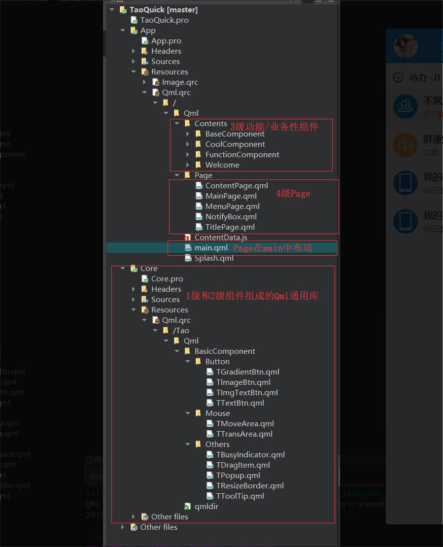
多级组件和Qml应用的框架结构
回过头来看一下,先是封装了两个组件:TMoveArea和TDragRect,之后又封装了一个组件:TResizeBorder,
而这个TResizeBorder里面使用了多个TDragRect组件,显然是有层级结构在里面的。
涛哥把TMoveArea和TDragRect这样的最基础的组件叫做一级组件,那么TResizeBorder就是一个二级组件。
涛哥大量的实战经验后,总结出了这样一种Qml应用框架结构:
一级和二级组件可以单独做成一个插件(或者叫Qml通用库)。

实际的Qml项目,在这些基础上,做一些功能性或者业务性的组件,即三级组件。

由这些三级组件组成一堆的页面(Page)。

最终的main.qml中,只剩下Page的布局。
示意图如下:
自定义窗口
自定义窗口,这里以QQuickView为主。
无边框
去掉边框,需要在C++中设置flag为Qt::FramelessWindowHint
同时我们注册view到qml上下文环境,给后面的功能来使用。
1
2
3
4
5
| ...
QQuickView view;
view.setFlag(Qt::FramelessWindowHint);
view.rootContext()->setContextProperty("view", &view);
...
|
可拖动窗口
将我们前面做的两种拖动框放在main.qml中,填满顶层Item,并指定control为view。
1
2
3
4
5
6
7
8
9
10
11
12
13
14
15
16
17
18
19
20
21
22
23
24
25
26
27
28
29
30
31
32
33
34
35
|
import QtQuick 2.0
#import TaoQuick 1.0 //这里是做成插件的情况下,引用了插件
#import "qrc:/Tao/Qml" //没有做插件的情况下,只要引用qml文件的资源路径即可
Item {
TitlePage {
id: titleRect
width: root.width
height: 60
...
TMoveArea {
height: parent.height
anchors {
left: parent.left
right: parent.right
rightMargin: 170
}
control: view
}
...
}
TResizeBorder {
control: view
anchors.fill: parent
}
...
}
|
自定义标题栏
标题栏的关键就是实现右侧的三个按钮,如果你看了《Qml组件化编程1-按钮的定制与封装》,
这都没有什么难度了。涛哥这里用图片按钮的方式实现。
注意最大化按钮在最大化状态下变成标准化按钮。
最小化:view.showMinimized()
最大化:view.showMaximized()
标准化:view.showNormal()
关闭: view.close()
这里给出关键代码
1
2
3
4
5
6
7
8
9
10
11
12
13
14
15
16
17
18
19
20
21
22
23
24
25
26
27
28
29
30
31
32
33
34
35
36
37
38
39
40
41
42
43
44
45
46
47
48
| Item{
...
property bool isMaxed: false
Row {
id: controlButtons
height: 20
anchors.verticalCenter: parent.verticalCenter
anchors.right: parent.right
anchors.rightMargin: 12
spacing: 10
TImageBtn {
width: 20
height: 20
imageUrl: containsMouse ? "qrc:/Image/Window/minimal_white.png" : "qrc:/Image/Window/minimal_gray.png"
onClicked: {
view.showMinimized()
}
}
TImageBtn {
width: 20
height: 20
visible: !isMaxed
imageUrl: containsMouse ? "qrc:/Image/Window/max_white.png" : "qrc:/Image/Window/max_gray.png"
onClicked: {
view.showMaximized()
isMaxed = true
}
}
TImageBtn {
width: 20
height: 20
visible: isMaxed
imageUrl: containsMouse ? "qrc:/Image/Window/normal_white.png" : "qrc:/Image/Window/normal_gray.png"
onClicked: {
view.showNormal()
isMaxed = false
}
}
TImageBtn {
width: 20
height: 20
imageUrl: containsMouse ? "qrc:/Image/Window/close_white.png" : "qrc:/Image/Window/close_gray.png"
onClicked: {
view.close()
}
}
}
}
|
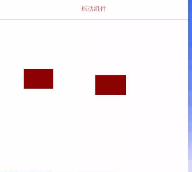
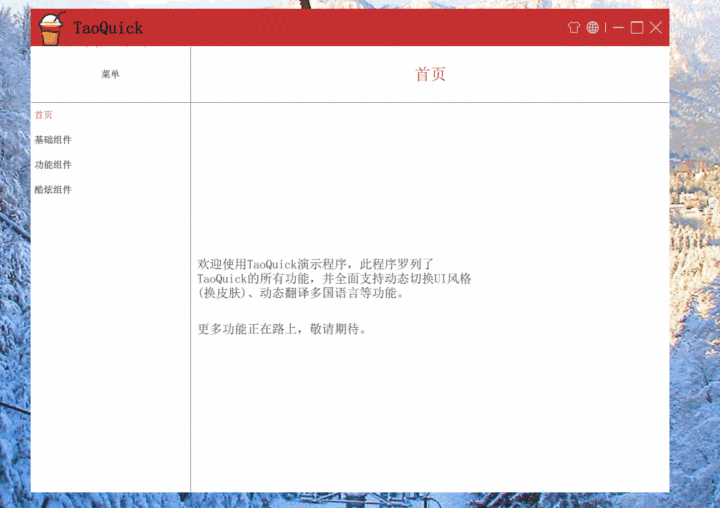
效果
最后,我们来看一下效果吧
 支付宝打赏
支付宝打赏
 微信打赏
微信打赏